
22 Designer-Inspired Kitchen Color Schemes to Transform Your Space
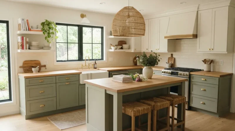
Pick the wrong color for your kitchen and you will feel it every single morning while you make coffee. Pick the right one and the room just feels good to stand in, even on a Monday. I spent way too long staring at paint chips before I understood that most kitchens people love are not built around one color at all, they are built around a pairing, like a cabinet tone next to a wall color, or a backsplash next to a countertop. That pairing is what makes a kitchen feel put together instead of random. This list walks through 22 color combinations that show up again and again in kitchens people actually love living in, along with where to use each one and how to pull it off without repainting your whole house. Whether you are working on a full renovation or just picking new paint for your cabinets this weekend, there is a combination here for you.
1. Sage Green Lowers
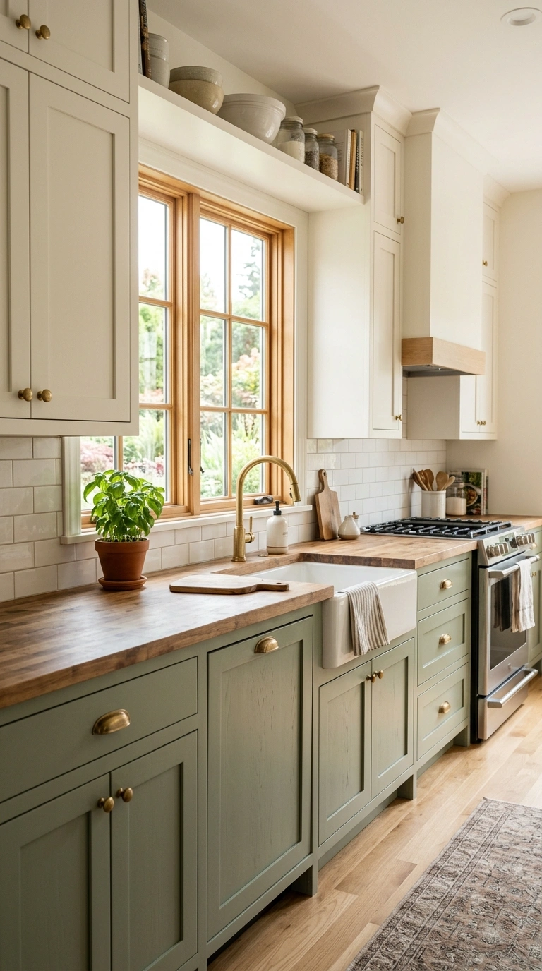
Painting only the lower cabinets a soft sage green while keeping the upper cabinets and walls a warm white is one of the most popular color schemes in kitchens right now, and it works because it adds color without overwhelming a room that already has a lot of visual activity from appliances and hardware. Sage sits between green and gray, which makes it easy to pair with both warm wood tones and cooler metal finishes like brushed nickel or matte black. Use a chalky, matte finish paint on the cabinet doors for a soft, aged look, and keep the countertop in a light material like butcher block or pale quartz so the green has room to stand out. Add brass or black knobs to finish the look, and consider a woven pendant light above the island to tie in a natural, earthy feel. This scheme photographs beautifully in kitchens with plenty of natural daylight coming through a window over the sink.
2. White and Black Kitchen
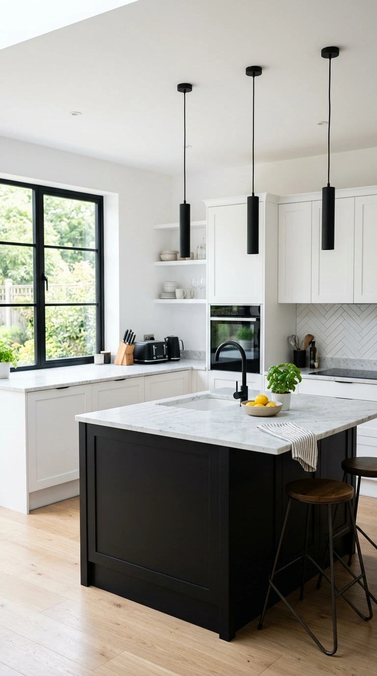
A crisp white kitchen with black accents is a classic color scheme that never really goes out of style, mostly because the high contrast makes every detail feel intentional and sharp. Paint the cabinets and walls in a clean white, then bring in black through hardware, faucet fixtures, pendant lights, and window frames if you have them. A black kitchen island in an otherwise white kitchen is another popular way to use this pairing, since it creates a natural focal point in the center of the room. Keep the countertops light, in white or pale gray marble or quartz, so the black accents have a clear background to stand against. This scheme works in kitchens of almost any size, but it looks especially sharp in kitchens with good natural light, since the white surfaces bounce the light around while the black details keep the room from feeling flat or too plain.
3. Navy Blue Island
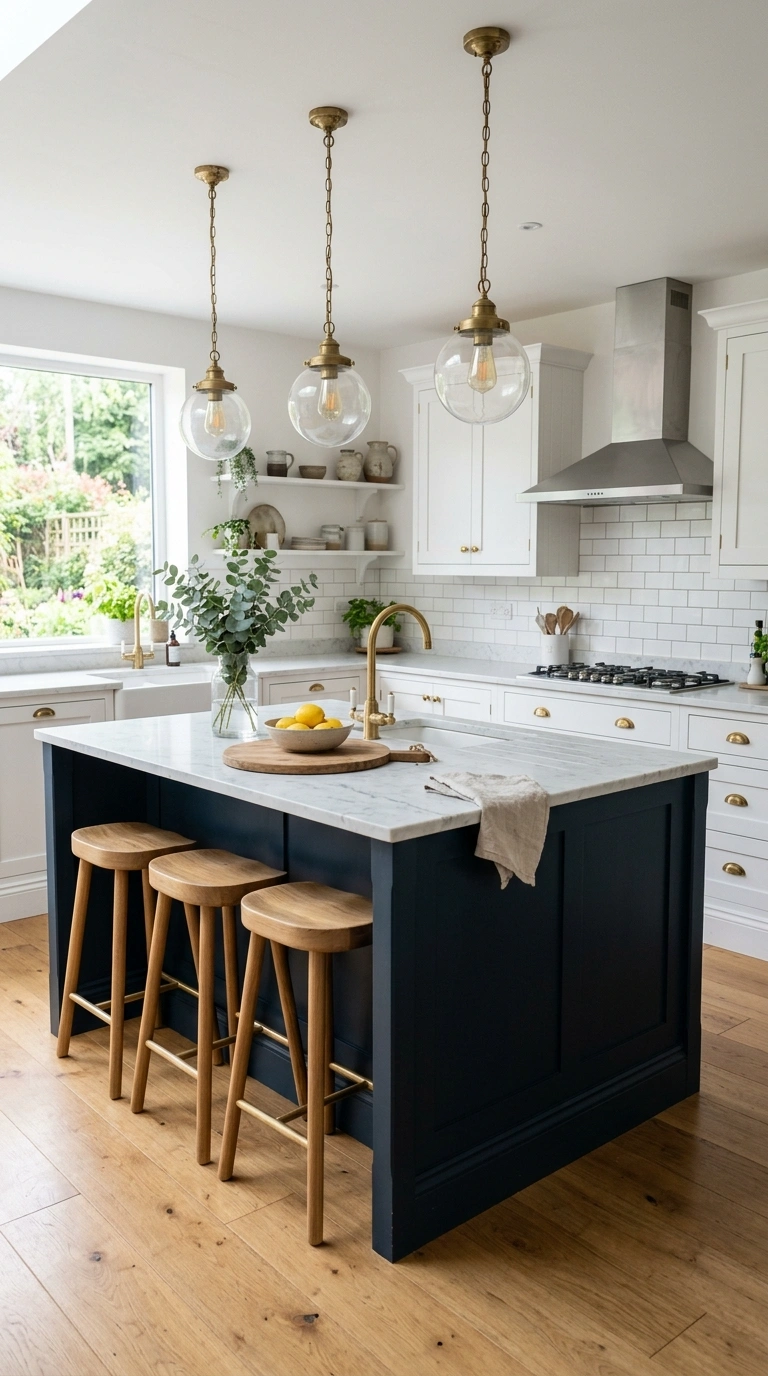
Painting just the kitchen island a deep navy blue while keeping the surrounding cabinets white or a light wood tone creates a striking centerpiece without committing your whole kitchen to a bold color. Navy pairs beautifully with brass or gold hardware, which adds a warm glow against the cool, deep blue tone, and it also works well with classic white subway tile on the surrounding walls. Choose a satin or semi-gloss finish for the island cabinets so the color reads rich rather than flat, and top the island with a light countertop material like white marble or a marble-look quartz to keep the contrast crisp. This scheme is a great option if you want to test out a bold color without repainting your entire kitchen, since the island is a smaller, contained surface. In photos, the navy island naturally draws the eye to the center of the room, giving the whole kitchen a designed, intentional feel.
4. Terracotta Tile Backsplash
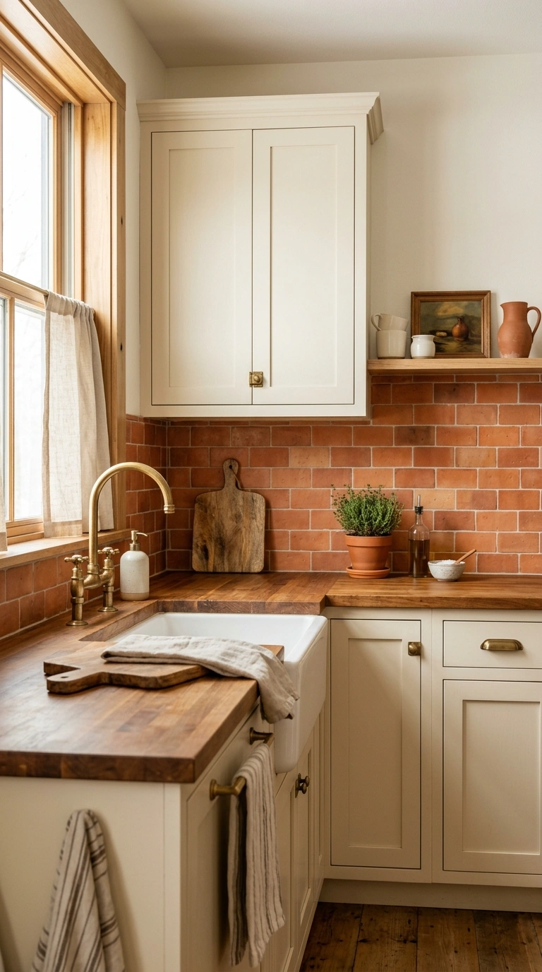
Using warm terracotta or clay-toned tile as a backsplash is a way to bring in color and texture without touching your cabinets or countertops at all, which makes it one of the easier updates on this list. Terracotta tones pair beautifully with white or cream cabinets and warm wood countertops, creating a cozy, sun-washed feeling that works especially well in kitchens with a lot of natural light. Choose a simple tile shape like a classic subway or a slightly irregular handmade-look tile for extra texture, and use a grout color close to the tile itself for a seamless, monochromatic look. This backsplash pairs well with brass or wood hardware rather than cool metals like chrome, since warmer finishes match the earthy tone of the tile. It is a great option for anyone who wants their kitchen to feel warm and inviting rather than sleek and cold, and it photographs especially well in the late afternoon light.
5. Charcoal and Oak
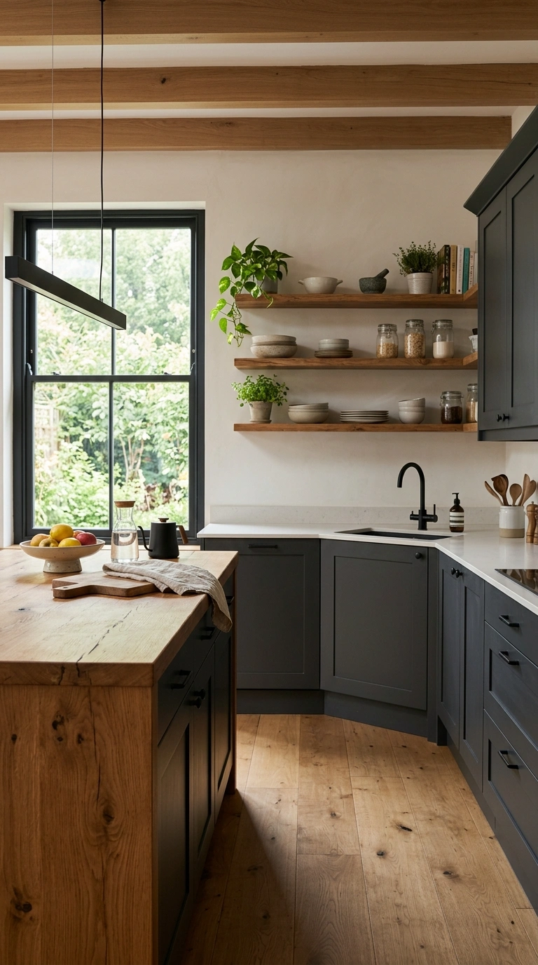
Pairing dark charcoal gray cabinets with warm oak wood accents, like open shelving or a wood countertop on an island, creates a modern but cozy kitchen color scheme that avoids feeling too cold or too dark. Use the charcoal on the main run of cabinets against the wall, and bring in the oak through a kitchen island top, floating shelves, or bar stools, so the wood tone breaks up the dark color and adds warmth. Keep the walls in a lighter neutral, like warm white or soft gray, so the charcoal cabinets do not make the room feel closed in. This scheme works especially well in kitchens with good natural light or additional overhead lighting, since the charcoal can read as flat or heavy in a dim room. Finish the look with matte black or brushed brass hardware, and add a few plants or wood cutting boards on display to soften the overall look even further.
6. Buttery Yellow Cabinets
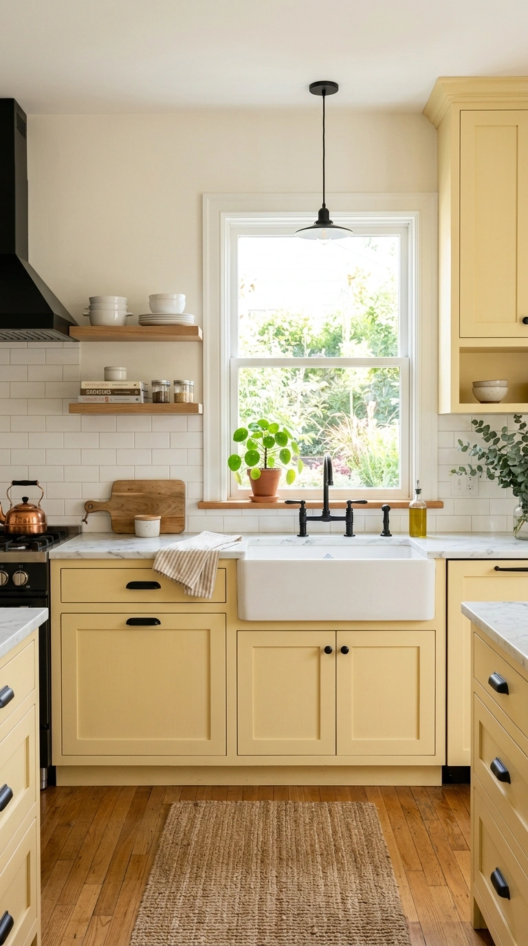
A soft, buttery yellow on kitchen cabinets is a color choice that feels cheerful without being overwhelming, especially when it is a muted, warm shade rather than a bright, saturated one. This color works particularly well on full cabinet runs in kitchens with white or cream walls, since the pale yellow reads as a gentle backdrop rather than a loud statement. Pair the cabinets with white or light marble countertops to keep the overall look airy, and use black or brushed brass hardware to add a bit of contrast and definition. This scheme suits kitchens that get plenty of natural daylight, since the yellow reflects and amplifies the light beautifully throughout the day. Add a few simple green plants on the windowsill or counter to complement the warm yellow tone. In photos, this color scheme reads as friendly and welcoming, making it a good choice for kitchens that double as a gathering spot for family and friends.
7. Black and Brass
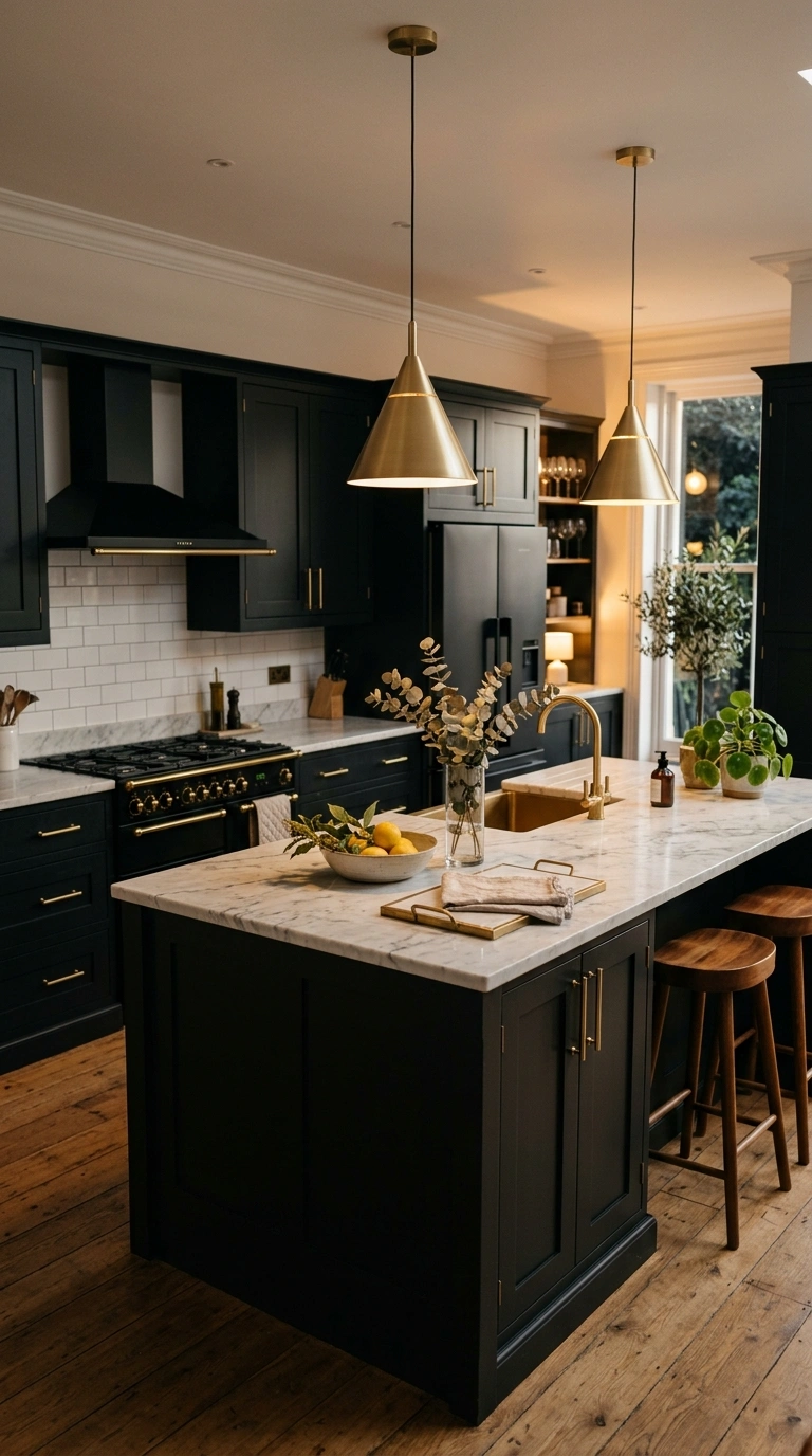
Combining matte black cabinets or a black kitchen island with warm brass hardware and light fixtures creates a rich, moody color scheme that still feels warm rather than cold. The brass adds a glow against the black surfaces, which keeps the room from feeling too dark or heavy, especially when paired with a lighter countertop material like white marble or pale quartz. Use brass on cabinet pulls, faucet fixtures, and pendant lighting above an island for a consistent, cohesive look throughout the space. Black cabinetry works especially well in kitchens with good natural light or several light fixtures, since dark colors can otherwise make a room feel smaller and dimmer than it actually is. This combination photographs beautifully in evening light, when the brass fixtures catch the warm glow of pendant lights against the deep black cabinetry, creating a dramatic but inviting mood that feels more like a boutique restaurant than a typical home kitchen.
8. Dusty Blue Cabinets
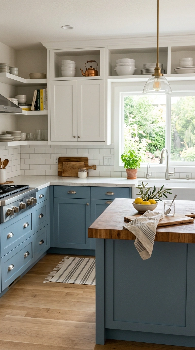
Dusty or muted blue cabinets, somewhere between a soft periwinkle and a gray-blue, bring color into a kitchen without feeling as bold as a true navy or bright blue. This shade works well on a full run of cabinets or just the lower half, paired with white upper cabinets and countertops for balance. Dusty blue pairs naturally with brushed nickel or unlacquered brass hardware, both of which complement the cool undertone of the color without competing with it. Use a warm white on the walls rather than a stark white, since this keeps the overall palette feeling soft and cohesive rather than harsh. A butcher block countertop on an island can add a nice bit of warmth against the cooler cabinet color, balancing out the palette. This color scheme suits kitchens that want a hint of personality without going too far from a neutral, calm base, and it photographs beautifully in soft morning light.
9. Warm White and Wood
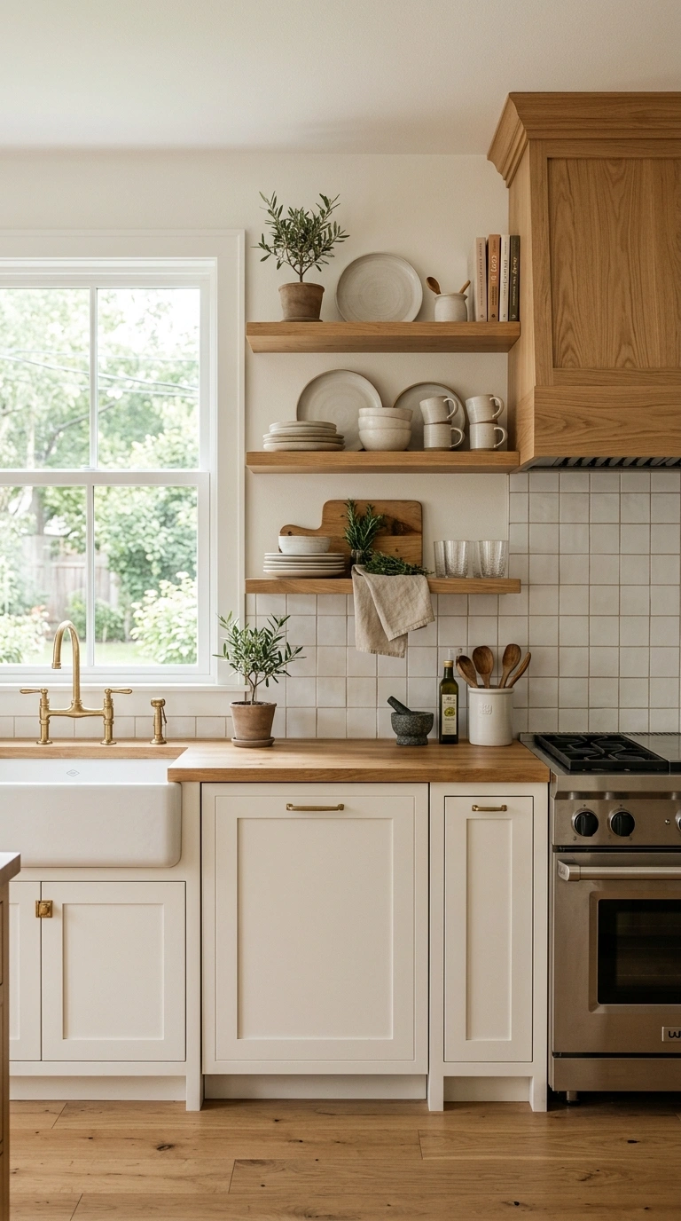
Pairing warm white cabinets with natural wood accents, such as open shelving, a wood range hood, or wood bar stools, is a simple color scheme that feels timeless and works in almost any kitchen layout. Choose a warm white with a hint of cream or beige rather than a stark, cool white, since this softens the overall look and pairs more naturally with wood tones. Use the wood in a few key spots, like floating shelves above the counter or a wood island top, rather than throughout the whole kitchen, so it reads as an intentional accent rather than mismatched materials. Light countertops in white or pale quartz keep the space feeling bright and airy. This scheme works especially well in kitchens with limited natural light, since the warm white reflects whatever light is available while the wood tones keep the room from feeling sterile. It is one of the most versatile color pairings on this list.
10. Deep Forest Island
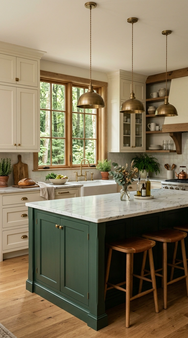
Painting a kitchen island in a deep forest green while keeping the surrounding cabinetry white or cream creates a rich focal point that still feels grounded and natural rather than trendy. Forest green pairs beautifully with brass or unlacquered brass hardware, and it looks especially good against a white marble or butcher block countertop on top of the island itself. Use a semi-gloss or satin finish on the green cabinets so the color has some depth and does not read as flat. This scheme works well in kitchens with an open layout, since the island naturally becomes the anchor point of the room when it carries the boldest color. Balance the green with plenty of white or cream elsewhere in the kitchen, including walls and upper cabinets, so the deep color does not feel overwhelming. In photos, a forest green island against white surroundings creates an elegant, editorial look that feels both classic and current at the same time.
11. Blush Pink Accent
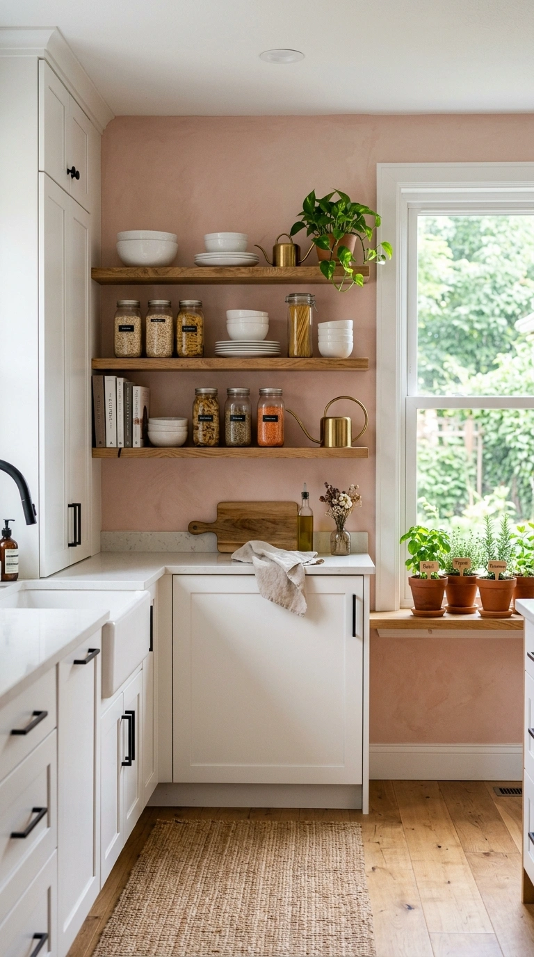
Adding a soft blush pink through a painted accent wall, a range hood, or even just the interior of open shelving is a gentle way to bring warmth and personality into a kitchen without overwhelming the space. Blush pairs surprisingly well with black or brushed brass hardware, and it looks especially soft against white or cream cabinets and countertops. Keep the blush contained to one feature, like a single wall behind open shelves or the front of an island, rather than spreading it across every surface, so the color reads as a deliberate accent instead of the main event. Add greenery nearby, like a small potted herb garden on the windowsill, to balance the softness of the pink with some natural texture. This scheme works particularly well in smaller kitchens or kitchen nooks, where a single accent wall can add charm and warmth without making the space feel busy or overly themed.
12. Matte Black Cabinets
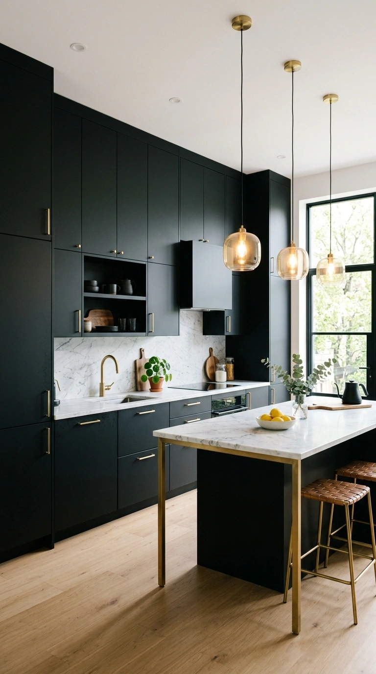
A full kitchen of matte black cabinets is a bold color choice that reads as sleek and modern, especially when balanced with plenty of light coming from windows, pendant fixtures, or under-cabinet lighting. Matte black hides fingerprints and smudges better than glossy black finishes, which makes it more practical for daily kitchen use. Pair the cabinets with a light countertop, like white marble, pale quartz, or a light wood butcher block, so the kitchen does not feel like one solid block of dark color. Brass or brushed gold hardware adds warmth against the black, while chrome or stainless steel appliances keep the look feeling sleek and current. This color scheme works best in kitchens with high ceilings or good natural light, since all-black cabinetry can make a small, dim kitchen feel closed in. In photos, this scheme photographs dramatically well, especially with warm pendant lighting above an island.
13. Cream and Terracotta
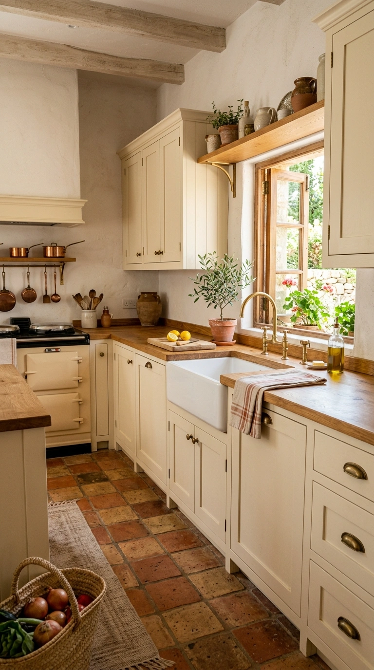
Combining cream cabinets with warm terracotta accents, whether through a backsplash, a tiled floor, or terracotta pots on open shelving, creates a warm, sun-baked color palette that feels relaxed and inviting. Use the cream as your main cabinet color throughout the kitchen, then bring in the terracotta through a smaller feature, like tile behind the stove or a runner rug on the floor, so the warm tone reads as an intentional accent rather than the dominant color. Pair this combination with brass or wood hardware to keep the palette feeling cohesive and warm from top to bottom. Natural wood countertops or open shelving complement this scheme especially well, since the wood grain echoes the earthy tones of the terracotta. This color pairing works beautifully in kitchens with a lot of natural light, since the warm tones glow during golden hour and give the whole room a cozy, Mediterranean feeling.
14. Olive and Walnut
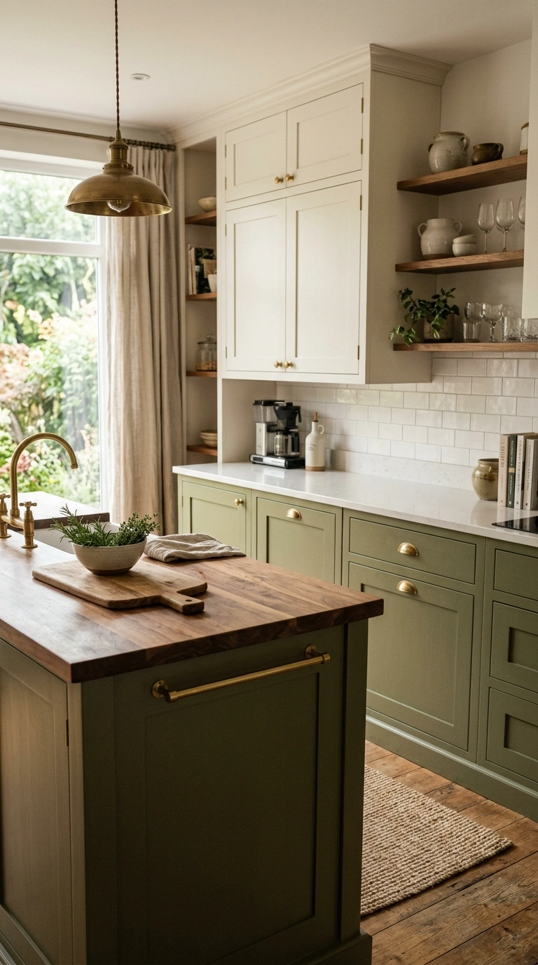
Pairing muted olive green cabinets with rich walnut wood accents, such as a wood island top or open shelving, creates a color scheme that feels earthy, grounded, and a bit more unexpected than typical kitchen colors. Olive green works especially well on lower cabinets, paired with a lighter neutral like warm white or soft beige on the upper cabinets and walls, so the darker olive tone does not overwhelm the whole room. The walnut wood adds warmth and a natural texture that pairs beautifully with brushed brass or matte black hardware. This combination suits kitchens with a more organic, nature-inspired style, and it works particularly well when paired with simple greenery on the counter or windowsill to echo the olive tone. In photos, this scheme reads as sophisticated and a little unexpected, giving the kitchen a distinct personality compared to more common all-white or all-gray color schemes.
15. Soft Gray and Brass
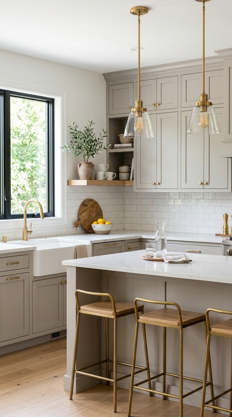
A soft, warm gray on kitchen cabinets paired with brushed brass hardware and light fixtures is a versatile color scheme that works in both modern and traditional kitchen styles. Choose a gray with warm undertones rather than a cool, blue-based gray, since warm grays pair more naturally with brass and wood accents. Use the gray across the main cabinet run, and add brass through cabinet pulls, a faucet, and a pendant light above the island or sink. Keep the countertops in a light material like white quartz or marble to balance the depth of the gray cabinets. This scheme works well in kitchens of almost any size, since the neutral gray base keeps the room feeling calm while the brass adds just enough shine and warmth to keep it from feeling flat. It photographs especially well in natural daylight, when the brass fixtures catch the light against the soft gray backdrop.
16. Beige and Marble
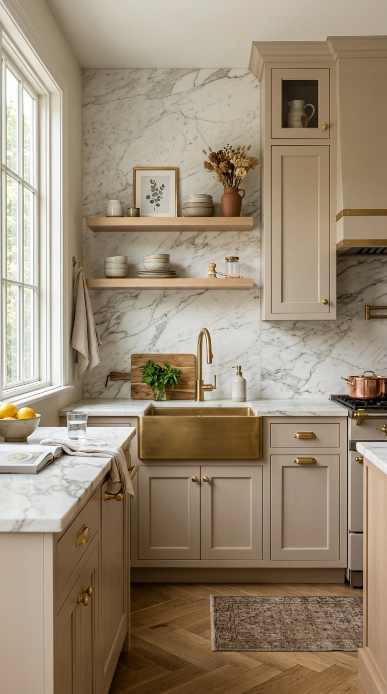
Pairing warm beige cabinets with white and gray veined marble countertops and backsplash creates a soft, classic color scheme that feels expensive without needing bold or unusual colors. Choose a beige with warm undertones, avoiding anything too pink or too gray, and use it across the full cabinet run for a cohesive look. Let the marble do the visual work through its natural veining, keeping the backsplash simple rather than adding a busy pattern on top of an already detailed material. Brass or brushed nickel hardware both work well with this palette, depending on whether you want a warmer or cooler overall feel. This color scheme suits kitchens that want a timeless, resale-friendly look, since beige and marble rarely feel dated the way trendier colors sometimes do. In photos, the soft beige and marble combination reads as calm and elegant, especially when styled with a few simple wood or ceramic accessories on the counter.
17. Burgundy Lower Cabinets
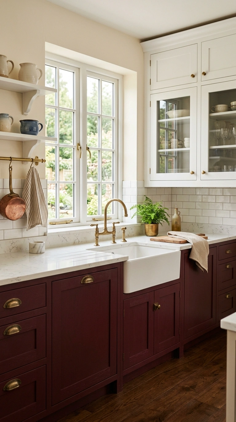
Painting only the lower cabinets a deep burgundy or wine red while keeping the upper cabinets and walls white or cream is a bold but balanced color scheme that adds richness without taking over the whole kitchen. Burgundy pairs beautifully with brass or matte black hardware, both of which add definition against the deep red tone. Use a satin or semi-gloss finish on the lower cabinets to give the color some depth and shine, and keep the countertop light, such as white quartz or marble, so the burgundy has a clean surface to contrast against. This scheme works especially well in kitchens with a more traditional or classic style, since the deep red tone feels rich and a little formal compared to lighter, more casual color palettes. In photos, this combination creates a dramatic lower half that still feels balanced thanks to the lighter tones above, giving the kitchen a sense of depth and intention.
18. Coastal Blue Palette
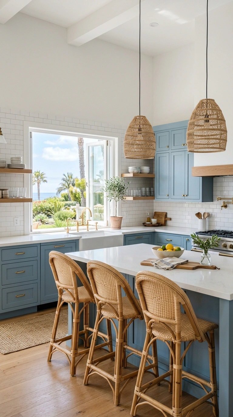
A coastal-inspired color scheme built around soft blue cabinets, white walls, and natural wood or rope accents brings a relaxed, breezy feeling into a kitchen. Choose a soft, muted blue rather than a bright or saturated one, and use it on the main cabinet run paired with white countertops and backsplash tile to keep the overall look light and airy. Bring in natural texture through woven pendant lights, a wood cutting board display, or rattan bar stools, which soften the blue and white base and add warmth. Brushed nickel or unlacquered brass hardware both work well with this palette, depending on the overall warmth you want in the room. This color scheme works especially well in kitchens with a window near the sink or dining area, since natural light enhances the soft, breezy feeling of the blue and white combination. It photographs beautifully in bright, sunny conditions, giving the kitchen a relaxed, vacation-like mood.
19. Mustard Tile Accent
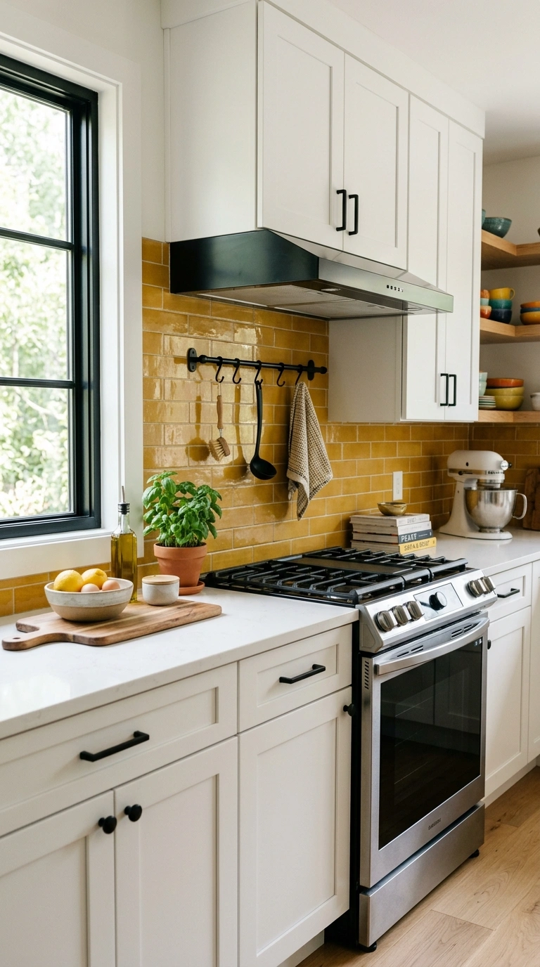
Using mustard yellow tile as a small backsplash accent, such as behind the stove or as a border strip along an otherwise neutral backsplash, is a way to bring in a bold color without committing to it across the entire kitchen. Pair the mustard tile with white or cream cabinets and a simple white countertop, letting the tile serve as the clear focal point of the room. Choose a tile with a slight texture or handmade look rather than a perfectly flat, glossy finish, since this adds richness to the bold color. Black or brushed brass hardware both work well with mustard tones, depending on whether you want a more modern or more vintage feel. This accent works especially well in smaller kitchens or as a feature behind a stove, where a contained pop of color can make a big visual impact without overwhelming the rest of the room. In photos, the mustard tile reads as playful and confident.
20. Charcoal and Copper
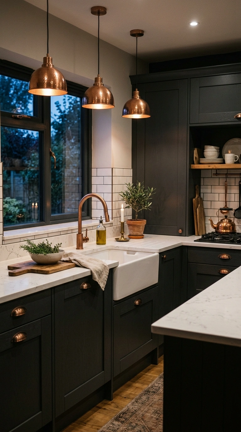
Pairing dark charcoal gray cabinets with warm copper accents, such as pendant lights, faucet fixtures, or a copper range hood, creates a moody but warm color scheme that feels rich and a little industrial. The copper tones add a warm glow against the cool, dark gray cabinetry, keeping the overall look from feeling too heavy or cold. Use the charcoal on the main cabinet run, and bring in copper through smaller fixtures rather than large surfaces, since a little copper goes a long way visually. Light countertops in white or pale quartz help balance the darker cabinet color and keep the kitchen from feeling closed in. This scheme works especially well in kitchens with good overhead lighting or plenty of natural daylight, since the copper needs light to really shine and catch the eye. In photos, this combination photographs dramatically well in evening light, when the copper fixtures glow warmly against the deep charcoal backdrop.
21. Cream and Sage
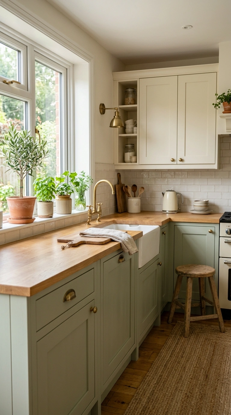
Combining cream cabinets on the upper half of the kitchen with soft sage green on the lower cabinets is a gentle, two-tone color scheme that feels fresh without being too bold. This pairing works especially well because both colors sit in a similar soft, muted family, which keeps the overall look calm and cohesive rather than high contrast. Use a warm cream rather than a stark white for the upper cabinets, since this softens the transition between the two tones. Brass or matte black hardware both complement this palette nicely, and a light wood or white countertop keeps the space feeling airy. Add a few simple green plants or herbs on the windowsill to echo the sage tone throughout the room. This scheme suits kitchens that want a hint of color without straying too far from a neutral base, and it photographs beautifully in natural daylight, when both soft tones read as warm and inviting.
22. Warm Clay Tones
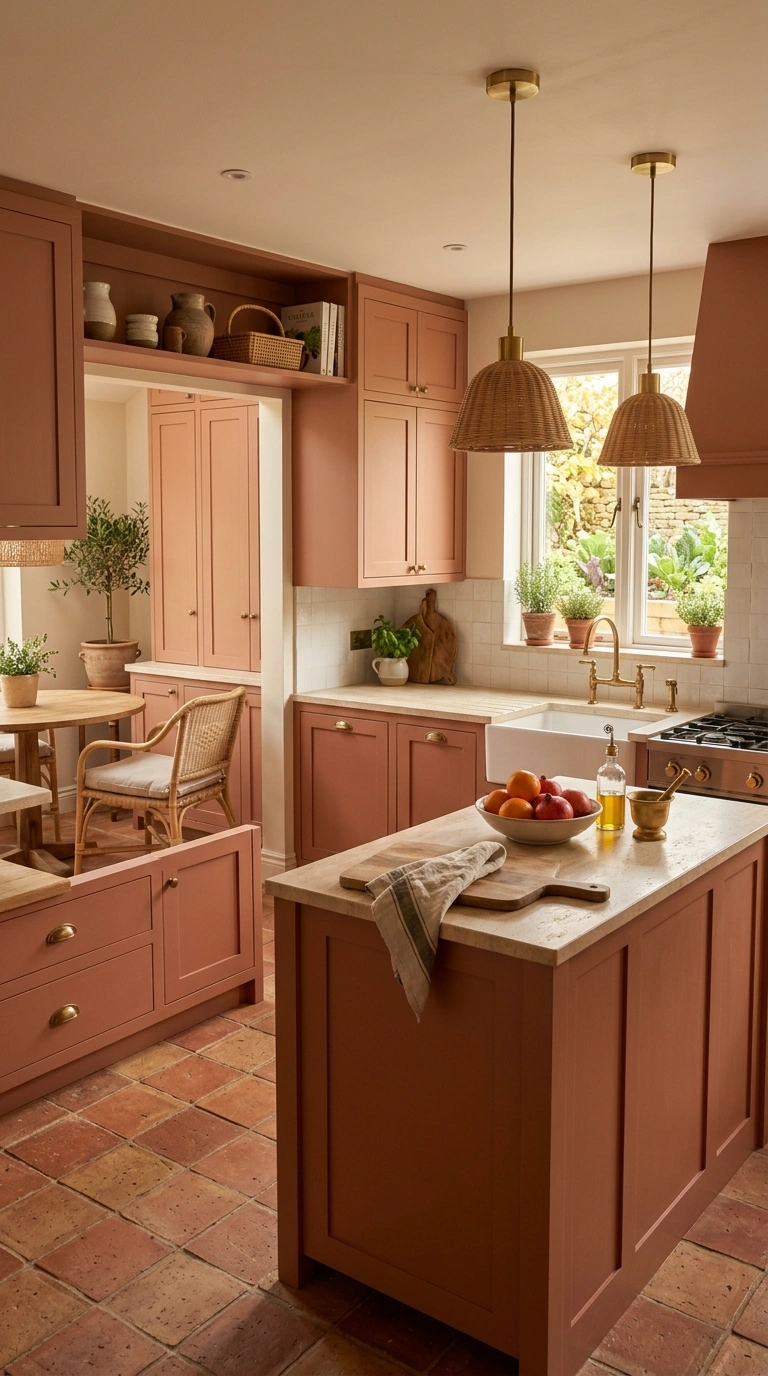
Building a kitchen color scheme entirely around warm clay and terracotta tones, from the cabinet color to the tile floor to the countertop material, creates a cohesive, sun-washed look that feels warm in every direction you look. Choose a muted terracotta or clay shade for the cabinets, then continue the warm tone through a matching or complementary tile floor and a light, natural stone or butcher block countertop. Brass, wood, and rattan accents all pair beautifully with this palette, reinforcing the earthy, natural feeling throughout the space. This scheme works especially well in kitchens with a lot of natural light, since the warm tones practically glow during the day and take on a golden quality in the evening. It suits a more rustic or Mediterranean-inspired kitchen style, and in photos, the consistency of warm tones from floor to ceiling creates a rich, layered look that feels intentional rather than accidental.
Choosing a kitchen color scheme really comes down to how the room makes you feel every day, not just how it photographs. Pick one or two colors from this list that match your personality, test them with paint samples or tile swatches before committing, and let the rest of the kitchen build around that pairing.